Are you looking to upgrade your kitchen for 2022? Remodelling your existing setup – or installing an entirely new one – is an exciting opportunity to breathe new life into your home. And given the kitchen is one of the rooms in which you’ll spend most of your time, it’s essential you get your choice right.
The world of interior décor is a constantly evolving animal, with new trends cropping up all the time. To save you time and effort, we’ve kept our fingers on the pulse throughout this year and into next, providing you with 16 of the best colours to paint your kitchen in these modern times.
White
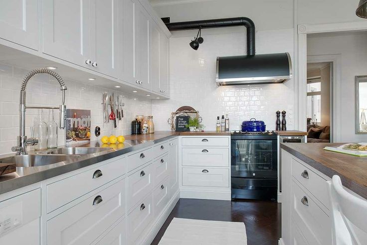
Nothing communicates a feeling of cleanliness and timeless charm quite like the pristine nature of white. Selecting a brilliant tone is ideal for minimalist décor with chrome finishing, while a creamy or off-white alternative goes well with wood panels and laminate floors. Marbled white countertops are another excellent choice for a contemporary kitchen, while the neutrality of the colour lends itself well to all kinds of accessories and appliances.
Grey
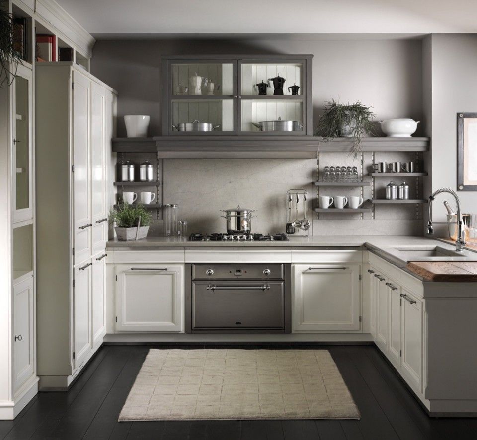
Speaking of neutrality, grey has been the flavour of the month in interior design circles for many years now. That’s because the colour is compatible with almost any other, while it imparts a sense of subtle interest and refined elegance to its surroundings. Those keen for a more modern aesthetic can bring in sweeping lines and metallic fittings, while a more traditional kitchen can be achieved via the use of natural materials like timber and stone.
Black
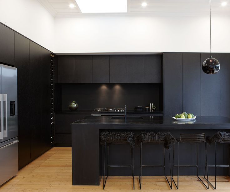
Though an all-black kitchen might be a little too avant-garde and austere for some, the brooding moodiness of a black space can be incredibly impressive when executed right. Ultra-modern in appearance, black communicates an impression of spotlessness and sophistication that simply isn’t available with other tones. On the other hand, it’s easy enough to dilute its impact by introducing complementary colours.
Pink
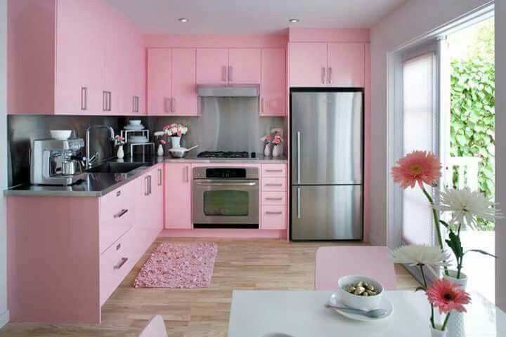
In the wrong hands, a pink kitchen can end up resembling something like a doll’s house. If that’s the aesthetic you’re aiming for, by all means kit your kitchen out in the boldest shades of the colour, but a more measured approach can pay massive dividends in the shape of a less ostentatious end product. Pastel pinks are especially effective at introducing light and cheer into a kitchen, making it a space that’s truly a joy to inhabit.
Plum
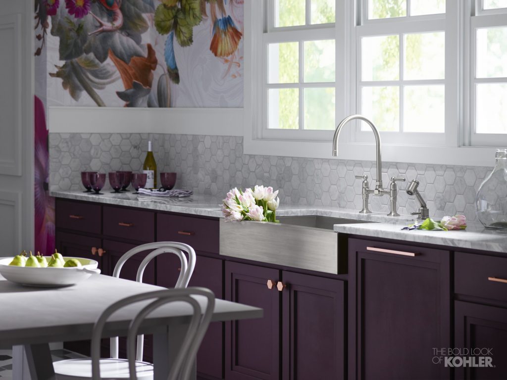
While plum might not be the first colour which springs to your mind when designing your dream kitchen, there’s a lot to be said for the depth and richness it can bring to its environs. With romantic connotations aplenty, it can add some extra spice to any kitchen recipe, while combination with natural elements like timber can introduce an autumnal feel into your home. Perfect for accentuating the warmth and cosiness of the kitchen.
Peach
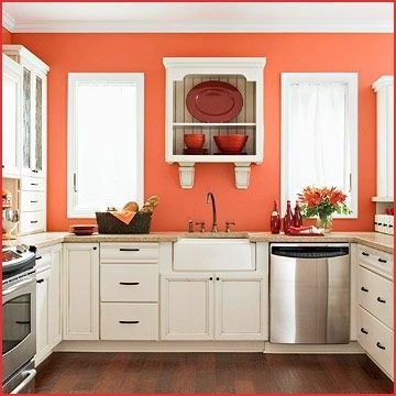
One of the sweetest and juiciest of all fruits, a peach colour scheme can impart similar qualities to your kitchen. For that reason, it’s important not to do overdo things, or else you might end up with a space so saccharine it makes your teeth hurt to look at. However, when managed in moderation, peach tones can imbue their surroundings with vitality and vim, breathing optimism into an otherwise jaded space. Focal points and feature walls are especially pertinent for peach painting.
Mint green
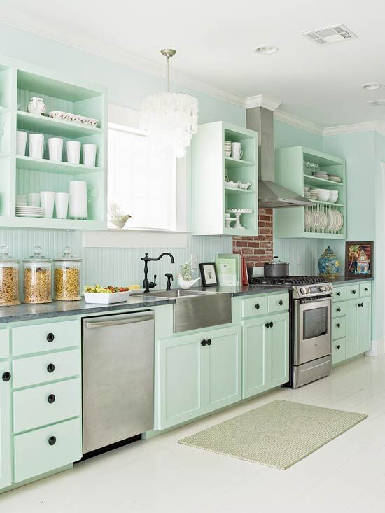
The minty aftertaste of toothpaste invariably carries connotations of cleanliness and hygiene. In a kitchen where food is prepared on a daily basis, those properties can be highly attractive to houseproud homeowners. The lightness of mint is also a key contributor to a room which feels expansive and full of potential, while combination with elements such as terrazzo tiles and marble countertops is a great way of achieving contemporary charm.
Mossy green
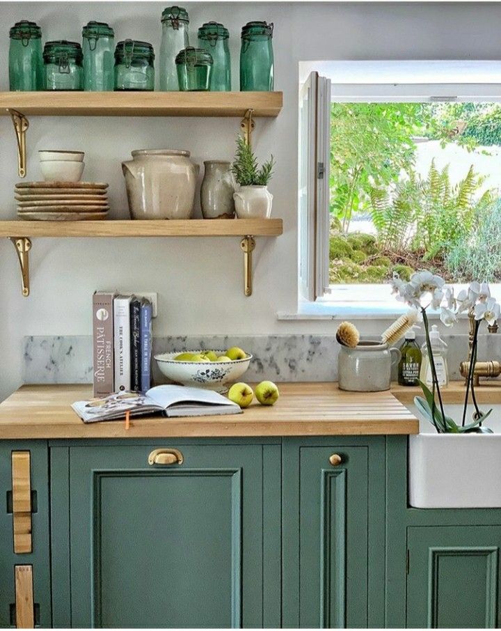
Alternatively, a darker shade of green can be just as refreshing. Given that the colour instantly brings to mind the fertile foliage of trees, ferns and other vegetation, green is highly effective at introducing elements of the Great Outdoors into your home. You can leverage that impact even further by using mossy green in tandem with wooden flooring and cabinets to create an invigorating environment for your household.
Navy blue
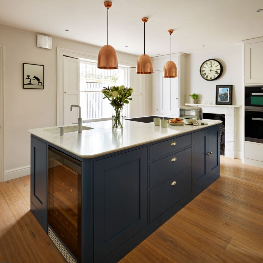
As with most dark colours, navy blue works best in a kitchen environment when it is used sparingly. Wall-to-wall navy can quickly become overwhelming and claustrophobic, but if combined with less oppressive tones like white, grey or lighter blues, it can create a smart and stylish end product. Just make sure to introduce creamy worktops and lighter fittings to offset the heavy-handed impact of navy and you won’t go far from.
Baby blue
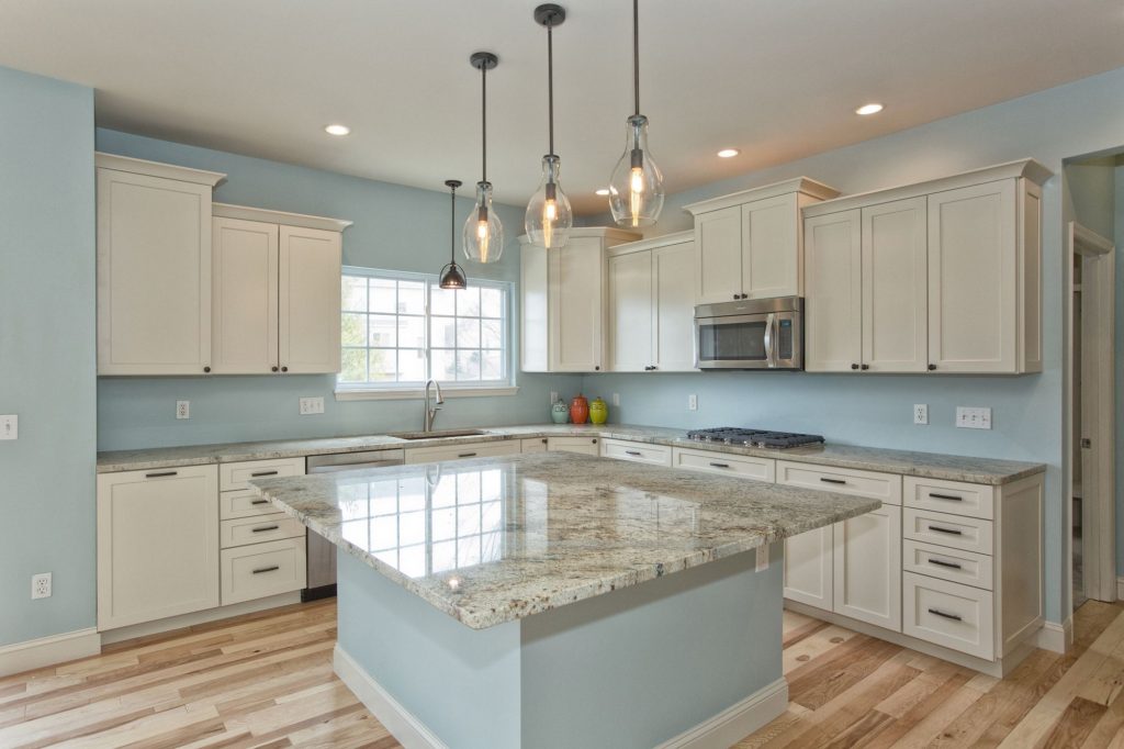
On the other hand, lighter blues are excellent for creating an expansive and uplifting feel in a room. Since birth, we have been conditioned to associate blue with the sea and the sky, so it’s little wonder that many people yearn to bring those elements into their home via the use of baby blue in their colour scheme. Complement its airy characteristics with white, grey or marble trimmings and you’ll arrive at a kitchen which puts a smile on your face every time you enter it.
Teal
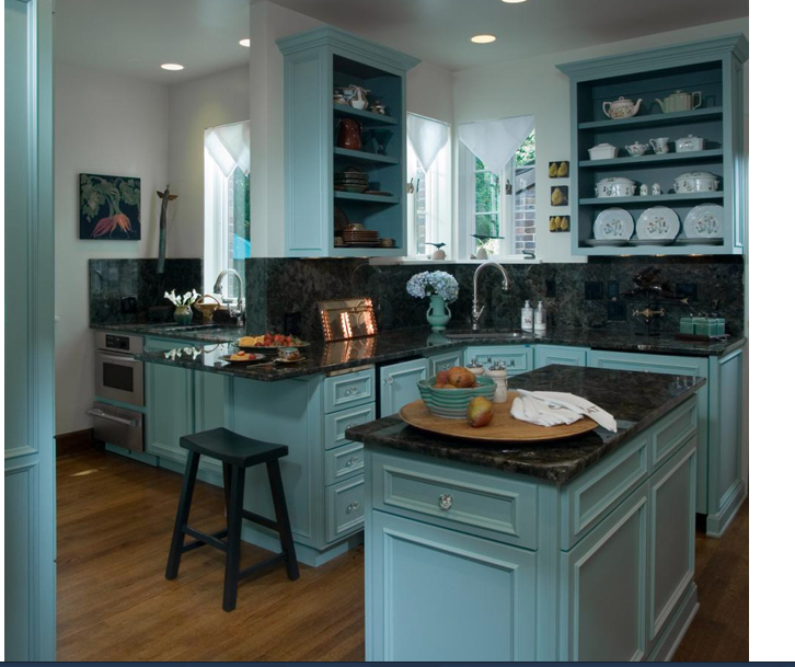
Can’t decide between green and blue? Neither can countless homeowners across the UK and beyond, which is why teal and turquoise have been among the most popular colour choices for kitchens for several years now. That trend looks set to continue into 2022, as teal is paired with dark marble for a more pensive aesthetic and copper for a quirky but contemporary one. Whatever end result you’re aiming at, teal can be a winning choice to achieve it.
Yellow
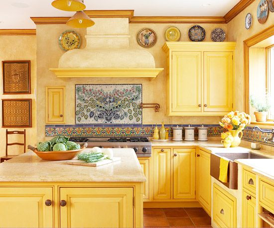
If you’re really looking to make a statement with your kitchen, an all-yellow aesthetic is a fantastic way of doing so. The display featured above incorporates mosaic tiling and marble countertops to create an environment that’s both sunny and exotic at the same time. However, you needn’t push the boat out quite so far with yellow paintwork. Toning down the hue to more of a saffron shade creates a subtler sheen that doesn’t sacrifice its cheer, which is why yellow is set to be a popular choice in 2022 for homeowners of all persuasions.
Tangerine
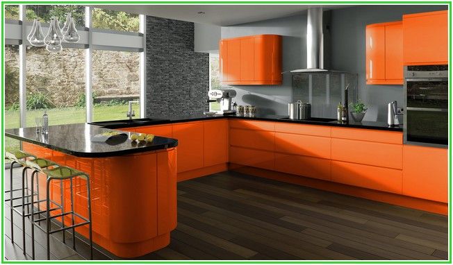
While we’re on the subject of bright and warm colours, it doesn’t get much toastier than tangerine. Again, this popping option can go both ways; pair it with sleek surfaces and black finishing for an ultra-modern aesthetic like the one pictured above, or else play it safer by partnering with white and pastel tones for a more sedate outcome. Whichever way you fall, you’re guaranteed to start your day with a healthy dose of vitamin C when cooking up breakfast in an orange kitchen.
Scarlet
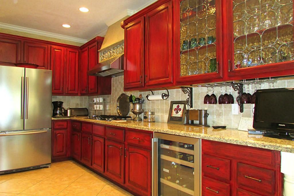
There are few options more dynamic than red when it comes to sprucing up your kitchen’s palette. The punchiness of scarlet cabinets is excellent at injecting some energy into your environment, while a more subtle effect can be achieved by simply staining wooden surfaces with a reddish hue as in the featured image. Depending on the level of audacity in your design, you can either go full Bolshevik with the revolutionary effect on your kitchen, or else restrict yourself to brightening up one or two appliances.
Coffee
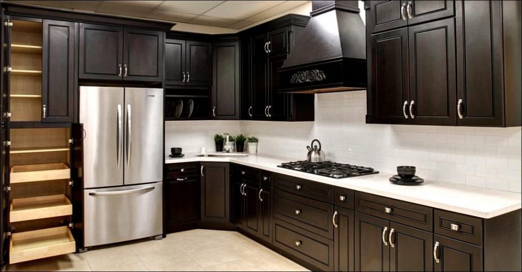
Brown has traditionally been regarded as a risky choice when it comes to decorating any room of the house, though a coffee-coloured kitchen makes perfect sense in more ways than one. On the one hand, it’s dark and comforting enough to create a welcoming space that reassures and relaxes, while on the other, it’s affiliation with caffeine means that it doesn’t lack for energy or endeavour. Of course, the success of such a colour scheme will hinge upon its pairings, though that remains true for any of the options on this list.
Timber
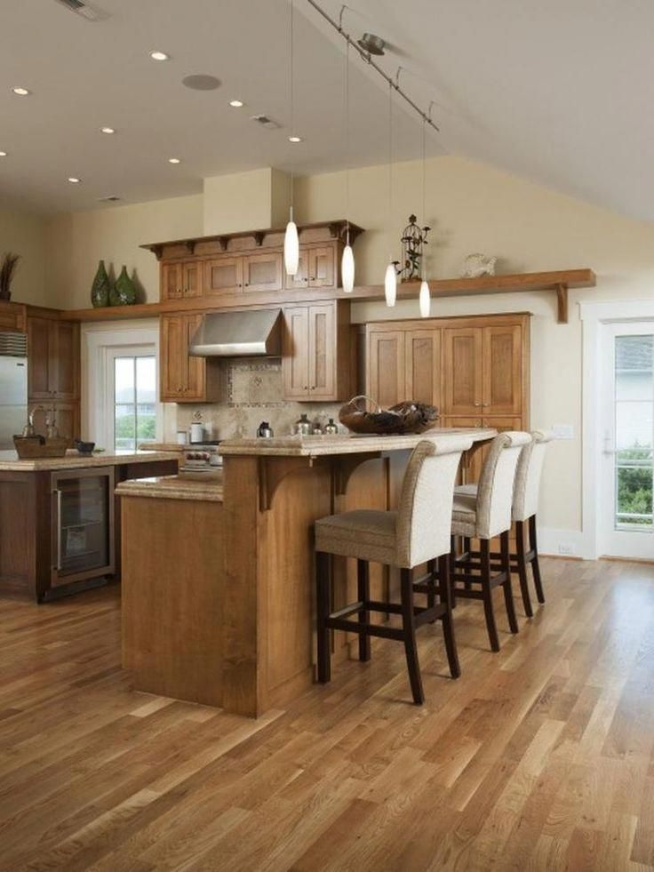
Of course, there’s also the option of letting the natural attraction of the materials in your kitchen do most of the heavy lifting from a design perspective. Timber is a popular choice for kitchen fittings for very good reason; it’s versatile, rustic and effortlessly stylish. Instead of labouring over which shade of paint you plan to coat your kitchen in, you could simply add some varnish to its existing surfaces and let its god given attributes shine through.
